Tuesday, 3 May 2011

Surface design for gift - Hallmark

My surface design for gift was a live assignment for hallmark. One of the design team members came into uni and gave us our brief and a selection of trends to choose from. I chosen the secret garden theme.
I gathered lots of research and took many photographs.
Mood Board
Visual Board
I started off by doing a sketchbook full of visual drawings linked to my theme, below I have selected a few of my pages from my sketchbook.


 I then scanned my drawings into the computer and created a large variety of gift wraps, cards and tags. I really enjoyed messing around with colour, effects and size while working on photoshop. I created five development boards from all the different cards, tags and wrap etc. that I had made.
Here are two of my development boards... 
From my development I selected the ones I thought worked the best and recreated them for finals. I wanted my collection to be very bright and vibrant and have a variety of different contrasting colours.
Here are my three boards showing my final collection... 
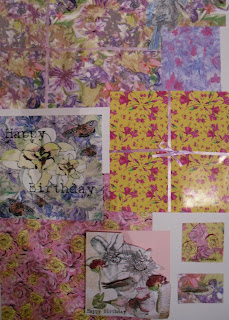
Over all I think my collection works well and I enjoyed designing all the bits and bobs for gift. One thing is that I wish i'd of had a little longer to do it because I would of loved to develop them even further and made my one  big collection into lots of little more focused collections.

Surface design for fashion - preditor kitsch

My Second Project in Second year was surface design for fashion (Embroidery)
I based my work on a trend called Preditor Kitsch. Preditor Kitsch is a trend based on wild animals and different animal prints but made to look different and quirky.
For this assignment I designed to work on Vest Top shapes. I started off by collecting as much research as possible on my chosen theme then began creating drawing sheets from them. From my drawing sheets I created some designs. I then choose three of them to create as finals.

Here are my final three...

I created this first Vest design in patchwork effect. I cut out my drawings and laid them on top of each other to create this unusual layered design. I have used a variety of different techniques and fabrics while creating this design. I wanted to achieve a textured effect.


To create this second design I just recreated one of my drawing sheets onto fabric. This is my favourite design because I think the scale of it works well on the top shape. I feel the embroidery works well on the dyed background and the pieces of devore velvet appliqued on resemble the tigers stripes well.

I created my third design in a different way again. I wanted to create a inky background so I used manutex pull through. I created each part of this design seperately using mixtures of hand and machine embroidery and applique. I then appliqued each part on.

Final samples for Roma


Following on from my previous post.. 

From my drawing sheets I created a variety of different layouts for furnishing fabrics.
To the left is my final painted out design. I chose this design because I felt it worked best for my theme and because its such a busy design it stood out against all my other layouts.


I choose these colours because they are bright and suit my theme and stand out against the black background.

Here is my final design printed onto fabric. I created it on black heavy cotton. I found it quite difficult printing onto such a dark background at first and my colours weren't coming out as vibrant as I liked. I then decided to use pigments with Opaque binder. This worked really well so I decided this was the best way to print my Final Design.


Aswell as doing a printed sample in the same colours as my painted out design I created several other prints in different colourways,
While doing this I wanted to experiment with different dyes to see what different effects I could create. I found it very interesting seeing how my design looked on totally different fabrics with different dyes and colours.
Here are two samples from my additional colour way prints:

Second Year - Surface design for interiors -Roma


My first project in second year was surface design for interiors.
I chosen the theme 'Roma'. Roma is quite a bright theme, based on flowers, russion dolls, fairgrounds and travellers
From the reseach I gathered for this theme here are my visual drawing sheets...

 Throughout my drawing sheets I tried to use a wide variety of different media such as: Water colours, pencils, Inks, and paints. I wanted to make them visually exciting to enable me to create exciting layouts to take through into print.


First year Surface design for Fashion - Embroidery

For my first year 'surface design for fashion' project I had to create 3 Embroidered Gament shapes.
I decided to use the dress garment shape and I based my embroidery mainly on florals.
To create my Dress Designs I photo copied my drawing sheets and put together some placements. I really focused on how to place the imagery on the dress shapes so they they worked together as a collection.

Here are my 3 Final Embroidered Dress Designs...

On this first design I used imagery of 2 birds I linked them together with 2 flowers and a stem with leaves on. I used a mixture of machine and hand embroidery as well as applique. Im quite happy with the result of this design appart from the slight puckering.


On this next dress design I kept the imagery just of flowers and created a flow from the top of the dress to the bottom. I used a variety of different size and coloured flowers to give the dress a bright summery feel. I also used a varity of different embroidery techniques to make the dress look more textured instead of being flat.


On the 3rd Dress design again I used just floral imagery. I focused the detail on the bottom right hand corner of the dress and made it flow towards the middle. Once again i used a variety of different embroidery techniques and appliqued pieces of dyed fabric on.


 Overal I am happy with my dress designs and think they work well as a collection. Obviously These designs are for University work purposes only because I would not be able to sell designs seperately with the same images used on them. 

Monday, 10 January 2011

First Year Embroidery Final Samples

For my introductory embroidery assignment I had to create paper layouts using imagery from my drawing sheets. I then had to produce them on fabric using different embroidery techniques to get the marks that suited each image best. I also use appliques and used dyes to create the backgrounds.

Here is 2 of my final samples:

On the first sample I have shown the fabric and paper version (paper bottom right, fabric top left). On the second sample I have just shown it done on fabric..


 Here are two close ups taken from each sample

First year - Introductory Surface Design

This is the first printing projects I did at CCAD in First year.
This assignment was all about experimenting with print. I created a koda layout of all different textures and shapes, taken from my drawing sheets. I then transfered the layout onto a Koda trace using different media, I  then exposed it to a screen.
 I layered the shapes from my screen on top of each other to create abstract prints.
Here is three of my final samples...


On this print i wanted to create a Stripe effect with quite pale colours for the background, I simply marked the stripes with masking tape and painted the dye onto the fabric. I then printed a striped texture over the top. For extra detail I added gold foil.


Again on this print I have Created a Striped effect, i have used a different range of colours colours. I think this one has a vintage feel about it.


In this print I have created a contrast with dark and light colours. I have used a variety of different shapes and marks from my screen and over layerd them to give the print more depth and texture.